Metro Map Custom Visual
What it is, how it works and how to use it


The Warning visual helps flag what's important in your data for your users. Let's say you have a data series for Debt. If this reaches a certain level, you want to warn your users, but if it is below this worrying level, you don't want to draw attention to it. Here, Warning can help you, by displaying an icon of your choice and colour, only if certain conditions are met. In this way, you preserve the real estate of your report page for what matters most to your users.
Now imagine instead that you are showing the number of pupils per class in a school. A number that is too low is a concern, and so is a number that is too high. Warning can help again, because you can set different icons for up to four different ranges. You might choose a green tick for a low class size, and a red cross for high class sizes, with information icons for medium values.
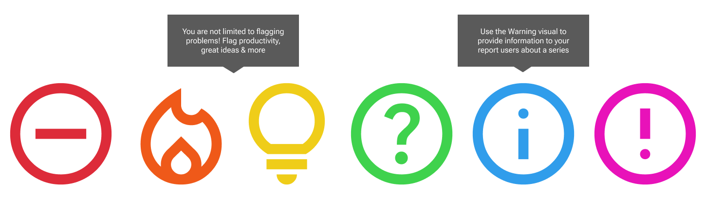
Warning visual does not just give warnings! It can be used to flag high number of sales, or great productivity, using the fire symbol. There are 14 icons to choose from, and many of them allow you to get creative with what data at that level means for you. If you'd like an icon that's not listed, let us know!
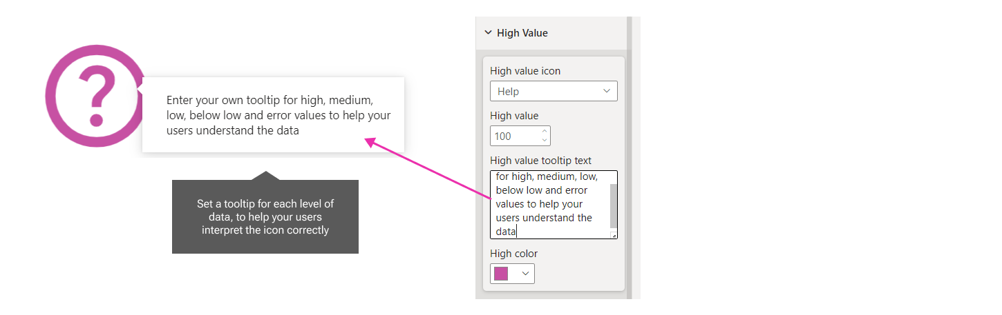
Set a tooltip in the formatting pane to help users understand what you mean by the icon. You could include the numeric level you have set in the tooltip as well. For example: "Sales are above $100k this month".

Reduce the effort for your users, by summarising entire numeric data sets with a tick, cross or arrow. They will be eternally grateful for you to lessen the burden of interpretation!