Metro Map Custom Visual
What it is, how it works and how to use it


Do you have a dataset of processes, locations or sequences? Metro is designed to visualize flow data in an engaging way, perfect for showcasing supply chains, processes, or stage gates. Unlike a force-directed graph, Metro is designed to show converging data.
Metro draws a network of paths between nodes, much like the lines on a metro map. In the example above, we've visualized gas pipeline routes from Russia to Western Europe, showing a series of dependencies.
Above is an image of Metro, not the real thing, so when you hover, nothing happens. But when used within Power BI, Metro can highlight the paths leading to and from any node. We call these precedent and dependent paths:
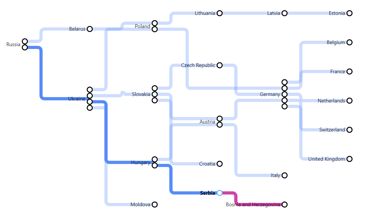
In the screenshot above, the user was hovering on Serbia. By default, precedent paths are highlighted in blue and dependent paths are highlighted in pink.
You can restrict this to just show either dependent or precedent paths; you can change the colours of these highlights; you can restrict them to clicking instead of hovering, or switch them off completely.
By default, you also see tooltips when you hover on nodes, with the keyword "Node". You can change this to something more meaningful - e.g. "country" - or switch tooltips off.

There are many formatting settings so you can get just the effect you want for your schematic diagram. Here, we are showing a diagram of some of the paths life can take, using skinny lines and prominent nodes.
In the example above, the user has clicked on the node "Work" and the paths leading up to work are highlighted grey, with the paths leading from work highlighted purple.
In the example below, we show two sets of train routes in the USA. Please note: not all data on this page will be accurate, they are just examples to show what Metro can do, and how it can be used.
