Status Bar Custom Visual
What it is, how it works and how to use it


Sometimes you need simplicity and beauty. Status Bar lets you show your category data as a series of highly customisable circles. Perhaps you want to show project phases, time, life stages, educational attainment, status, priority or size. Status Bar lets you do this in style.
By default, you can sort your circles numerically or alphabetically, but you can add an optional data series specifically for sorting if you wish. Tooltips work as standard and you can click to filter or highlight other visuals in your report.
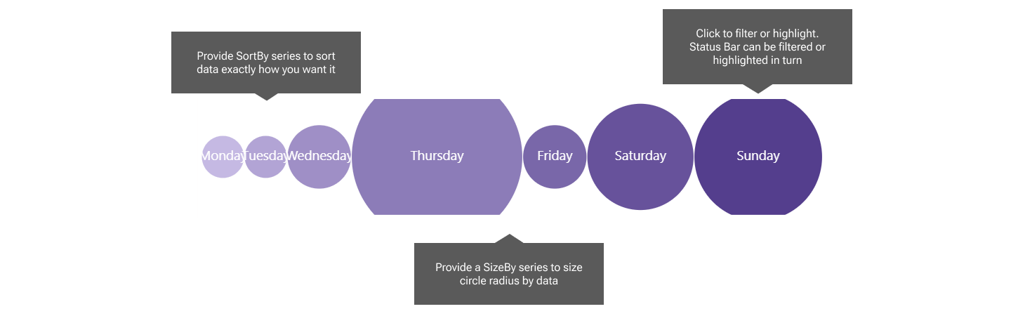
You can drive the circle radius with data if you provide a "Size By" series. By default, circles are coloured by interpolation: provide a start and end colour, and we will interpolate between them. If you want a single uniform colour, just set start and end color the same.
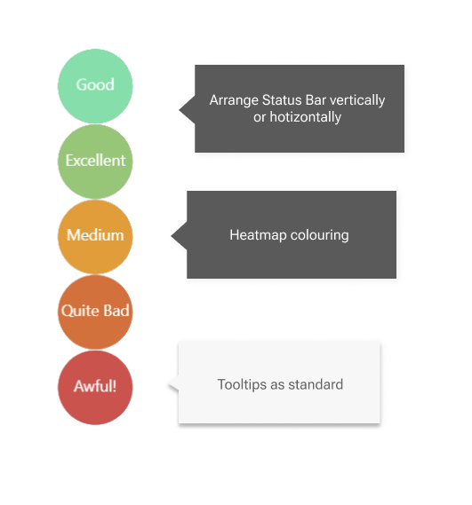
Arrange your circles vertically or horizontally, with the flick of a single dropdown.
Make your circles meaningful with heatmap colouring. Just provide High Medium and Low values, with corresponding colours, and we will interpolate the rest.
You can remove the gap between the circles to create a merged color effect.
If you need some circles in a hurry, you can switch on the Manual Override toggle, and type the values you want in a semi-colon separated list. You can still color by interpolation.
The Status Bar visual offers tooltips as standard. Category will always appear, since it is mandatory. If you provide the optional number series, these will also pop into the tooltip. Color By data will only show if you also have Color By toggled ON in the formatting pane. If you use Manual Override, these features are disabled, since your data series are no longer connected to your circles.
Status Bar can filter or highlight other visuals, depending on the choices you make under Edit Interactions. Status Bar can also be filtered or highlighted. Inbound highlighting can only work if you have provided a numeric series into any of the three optional numeric data wells.