Metric Custom Visual
What it is, how it works and how to use it


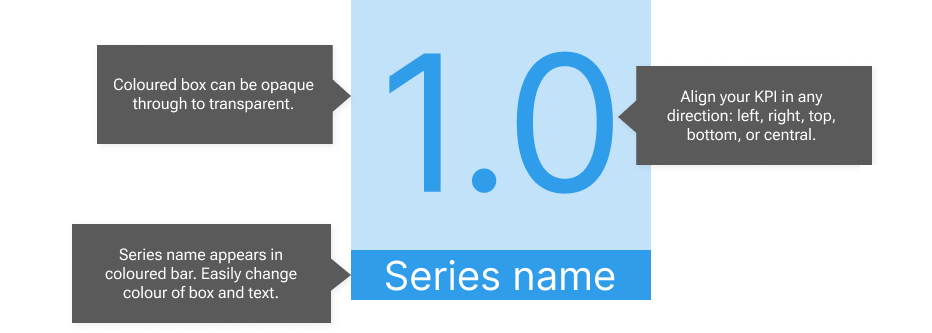
The example above showcases the essential features of Metric: your KPI appears in a transparent box with the series name in an opaque box of the same colour. You can easily change the transparency of the number box, from opaque to entirely transparent.
You can change the alignment of the KPI (top/bottom and left/right) and the alignment of the series name (left/right). The series name box changes height as you change the font size, but is always full width and either above or below the KPI.

When you first open Metric, it will inherit any theme colours you have set. If you don't have themes set, Metric defaults to blue. You can easily override the colour of both KPI and series name with one setting. Metric will also pick up on any data formats, if they are set. So if you drag a financial series in, Metric will display the currency symbol.
If you have decimal places set in your data formats, Metric will display the correct number of decimals. If you choose a Display Units setting of "Auto", Metric will identify whether your KPI is thousands, millions, billions or trillions, and apply appropriate notation. If these things are not set, you can change them manually in the formatting pane.

Do you worry that your audience won't understand what the numbers mean? Sometimes the series name just isn't long enough to tell users how to interpret the data. Explain it to them in a tooltip! You don't need to pull a data series in for the tooltip - just type it in to a text area component in the formatting pane.
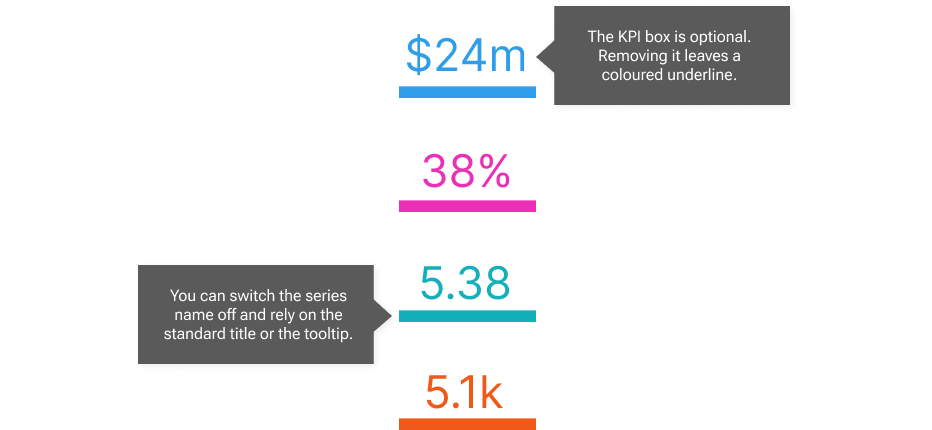
You can switch off the series name and make the KPI box transparent, leaving a coloured underline style that can look great as a sidebar in reports.
You can switch off the default title in the Formatting pane > General tab > Title. You can add an optional background colour in the same place under Effects - see the screenshot below for examples on how great this can look in the column "Can use themes". Metric also looks good on dark backgrounds. Why not download it and have a play - it's free for the first month.
