Filter Bar Custom Visual
What it is, how it works and how to use it


Want a cleaner, more intuitive way to filter your category data? Filter Bar lets you do this with ease, offering a visual filter experience that goes beyond standard slicers. Whether you're categorizing by days, departments or product type, Filter Bar provides a streamlined approach that keeps your report uncluttered.
Customize the look to fit your design: use color gradients to make each bar visually distinct or keep it simple with uniform colors. Just choose a start and end color, and we'll handle the blending.
Filter Bar is built for flexibility—you can sort categories alphabetically, numerically, or by a custom data series to suit your needs. Tooltips come enabled by default, and a single click filters other visuals in your report.

Filter Bar can do more than just display categories—it can also reflect the relative sizes of your data points. In this example, each rectangle’s width represents the magnitude of a specific value, offering a quick visual cue to see how categories compare at a glance. This is especially useful for data like sales figures, counts, or any metric where size matters.
The sizing option adds depth to your filtering experience, allowing users to focus on larger or more relevant categories without the need for separate charts. You get an interactive filter that conveys both structure and scale, all in one compact visual.
With rectangles sized proportionally, Filter Bar lets you maintain a clean report layout while still bringing attention to key data points. This approach helps avoid the clutter of traditional charts, making it an ideal choice for dashboards where space and simplicity are priorities.
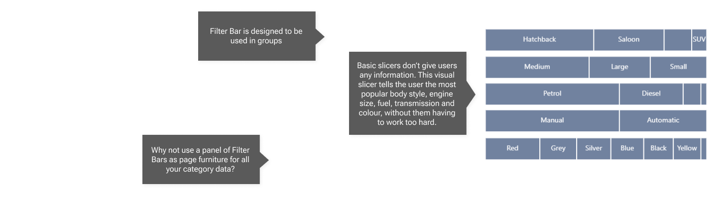
In this example, five Filter Bars are aligned to create a clean, cohesive filtering panel. Positioned as "page furniture," this panel provides a streamlined way to slice your data across pages, adding functionality without taking center stage. By keeping the colors subdued and opting for a consistent, non-gradient style, the panel remains visually subtle.
This approach turns Filter Bars into an unobtrusive yet effective tool for navigating and filtering data. Each bar in the panel serves a specific category or filter, allowing users to interact with the data naturally, without the distraction of traditional slicers or bright visuals. This understated design provides a calm, organized filtering experience, ideal for reports with multiple pages or where data exploration is a focus.
You can use the filter panel's across pages to unify your report, creating a consistent look across pages. With Filter Bar's flexible customization, you can adjust the layout, colors, and order to match your report's theme, ensuring that the panel enhances, rather than overwhelms, the user's experience.

This example shows how Filter Bar can use gradient heatmap coloring to represent data values through color intensity. Simply set colors for the highest, middle, and lowest values, and Filter Bar smoothly transitions between them, giving each category a shade that reflects its data value.
Heatmap coloring makes it easy to see data patterns at a glance, with high values standing out in bold colors and lower values fading into subtler tones. This approach adds depth to your filter by visualizing data trends directly within the bar, so you don't need extra charts or labels.
Customize the color gradient to fit your report's style, ensuring that key data insights are visually highlighted in a way that's both informative and unobtrusive.

In this example, a panel of five vertically arranged Filter Bars is shown with reference lines at 25%, 50%, and 75% widths. While Filter Bar itself doesn't currently support labels or reference lines, this setup illustrates that you can compare the rectangle widths across categories as long as each Filter Bar uses the same numeric data series. This can be particularly helpful for comparing values like proportions, sizes, or rankings across multiple filters in a consistent way.
By adding your own visual cues, such as lines or labels, you can enhance Filter Bar to make cross-category comparisons more intuitive. For example, using consistent scaling allows users to immediately see which categories stand out across different filters without the need for additional charts or detailed labels.
This approach turns Filter Bar into a comparative tool, letting you use visual widths to convey meaningful differences across multiple categories. With a few simple adjustments, your filter panel becomes not just a slicer but a clear visual reference for your data.