Dividers Custom Visual
What it is, how it works and how to use it


The ultimate in space-saving design: Dividers let you showcase your category data as a series of visually appealing tabs. Whether you want to display days of the week, project phases, life stages, or priority levels, Dividers combine functionality with style.
With the option of gradient coloring, your data is presented in a way that's both informative and eye-catching. Sorting is flexible: by default, tabs can be sorted alphabetically or numerically, but you can provide your own numeric sort series.
Click to filter or highlight, depending on your settings. Clicking other visuals will also filter or highlight your dividers.
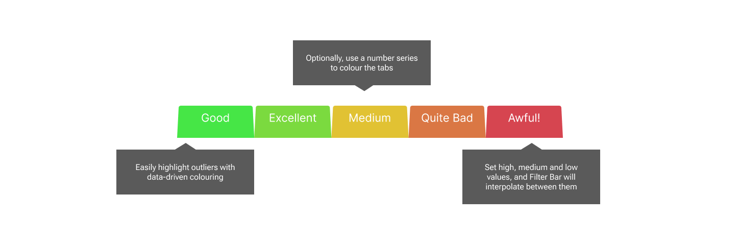
Heatmap colouring is an option for your tabs. Just provide High Medium and Low values, with corresponding colours, and Power BI will interpolate between the values and colours to provide heatmap colouring. You can use it to emphasize outliers in the data by using just high and medium colours and values.

Arrange your dividers vertically or horizontally, with the flick of a single dropdown.
You can remove the gap between the tabs to create an overlapped tab effect, or increase the gap to separate them.
If you need tabs in a hurry, you can switch on the Manual Override toggle, and type the values you want in a semi-colon separated list. You can still color by interpolation.
The Dividers visual offers tooltips as standard. Category will always appear, since it is mandatory. If you provide the optional number series, these will also pop into the tooltip. Color By data will only show if you also have Color By toggled ON in the formatting pane. If you use Manual Override, these features are disabled, since your data series are no longer connected to your tabs.
Dividers can filter or highlight other visuals, depending on the choices you make under Edit Interactions. Dividers can also be filtered or highlighted. Inbound highlighting can only work if you have provided a numeric series into any of the three optional numeric data wells.